
Winter Olympics
VISUAL IDENTITY SYSTEM
Some projects ask you to design for an event. This one asked for something more — a sense of place.
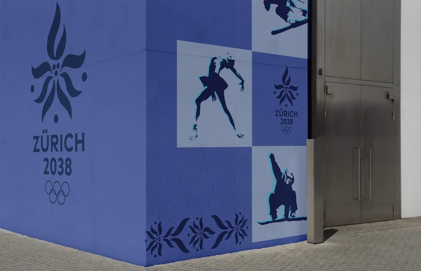
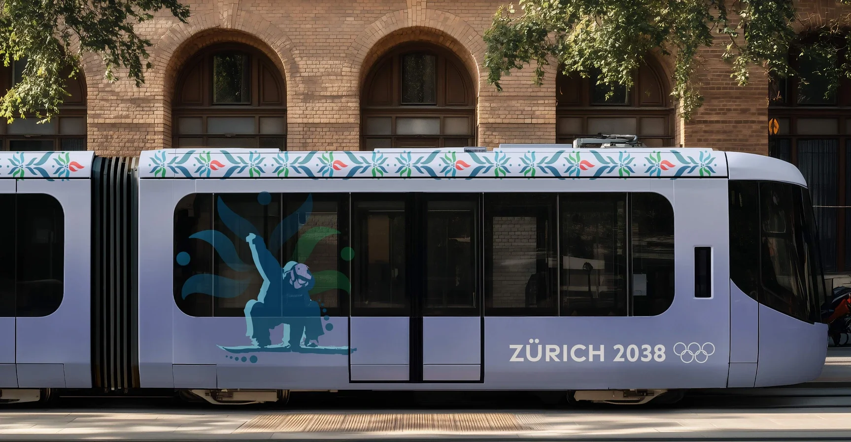
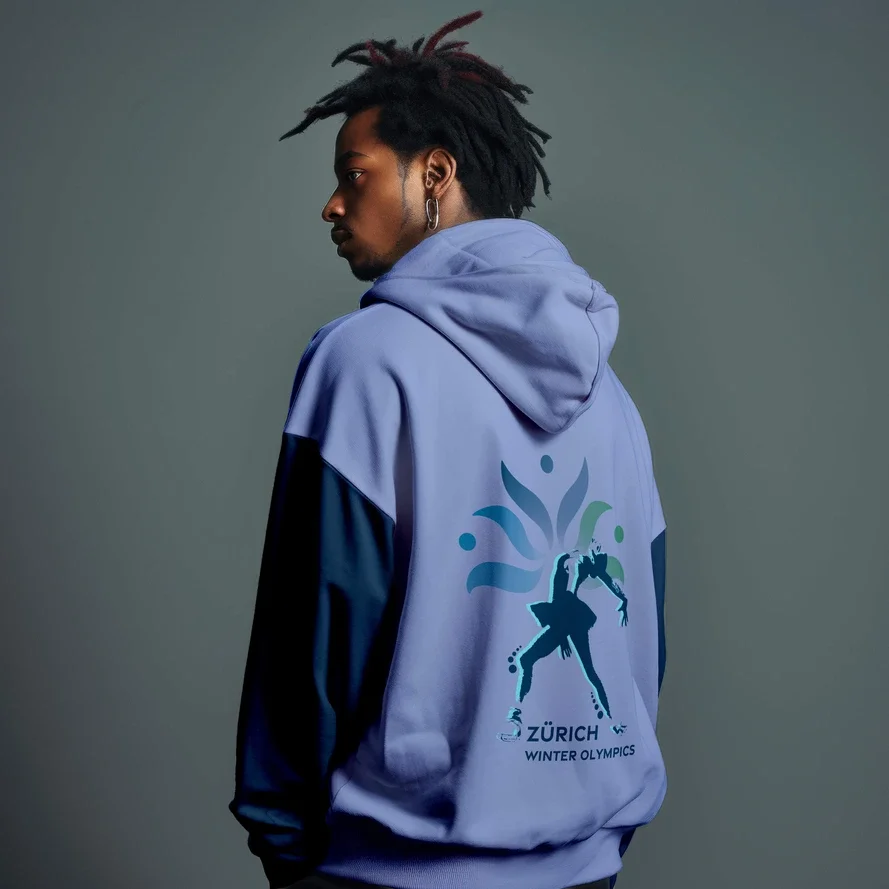
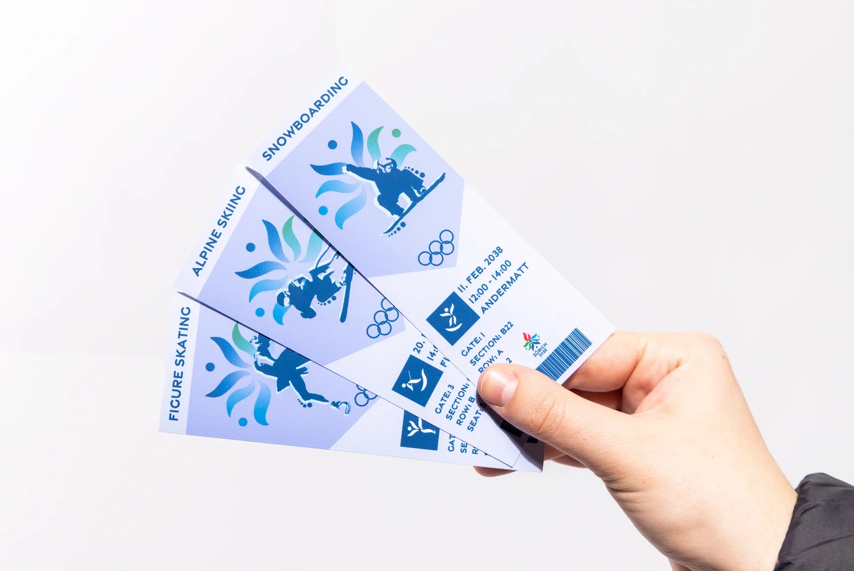
This visual identity system for the Winter Olympics in Zurich, Switzerland draws from the country's deepest roots, the Edelweiss, Switzerland's national flower and a timeless symbol of strength and resilience, and brings it into conversation with the global language of sport. At the center of the mark, a stylized grouping of figures represents unity and victory, while the upper form quietly echoes the Olympic torch, nodding to the spirit of competition without shouting it.
The result is a logo that feels both proudly Swiss and warmly universal.

SERVICES PROVIDED
Brand Strategy — Defining the visual and conceptual direction for a globally recognized event
Logo Design — Crafting a mark that balances cultural symbolism with athletic energy
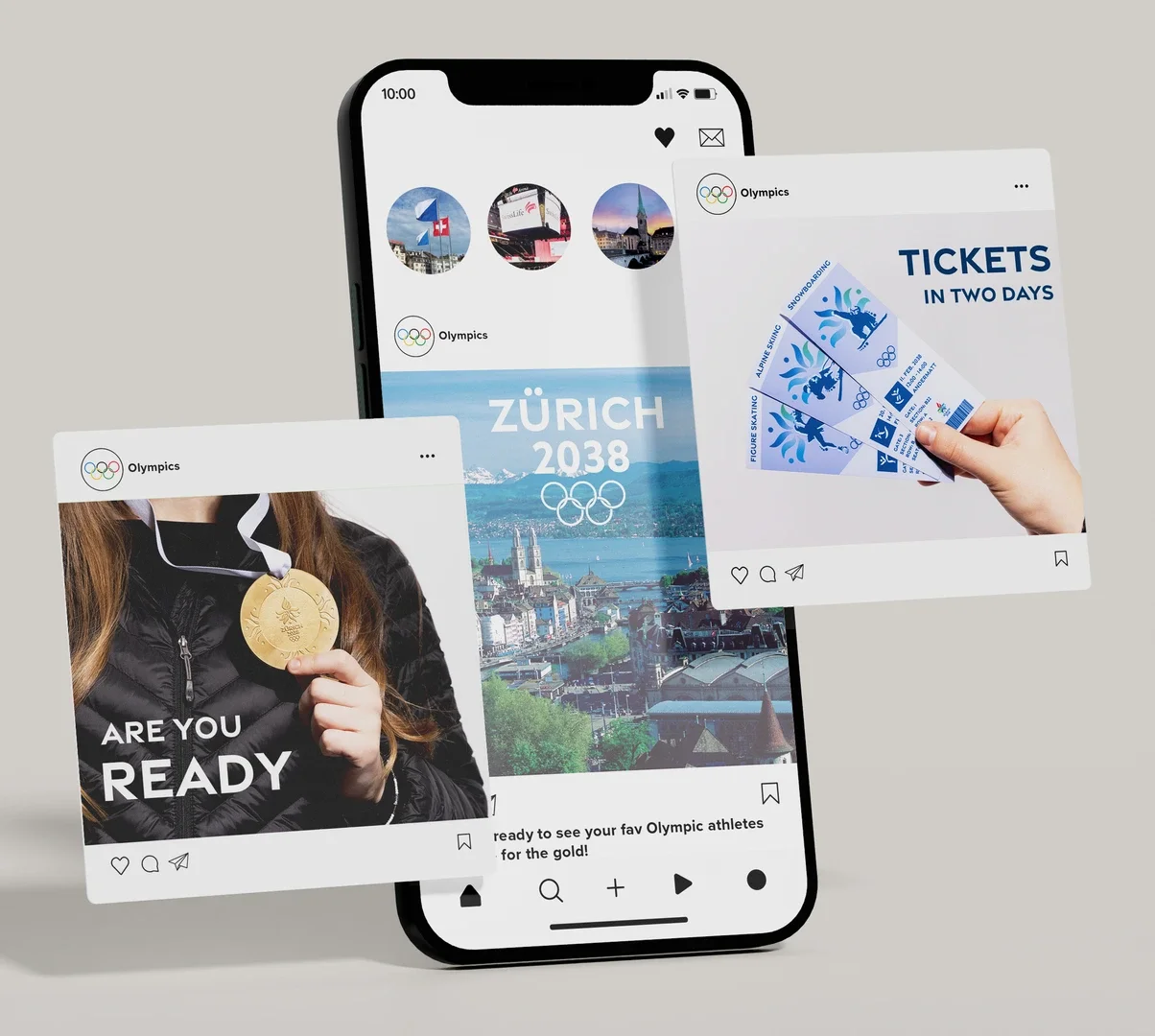
Visual Identity System — Developing a cohesive, scalable design language across all touchpoints
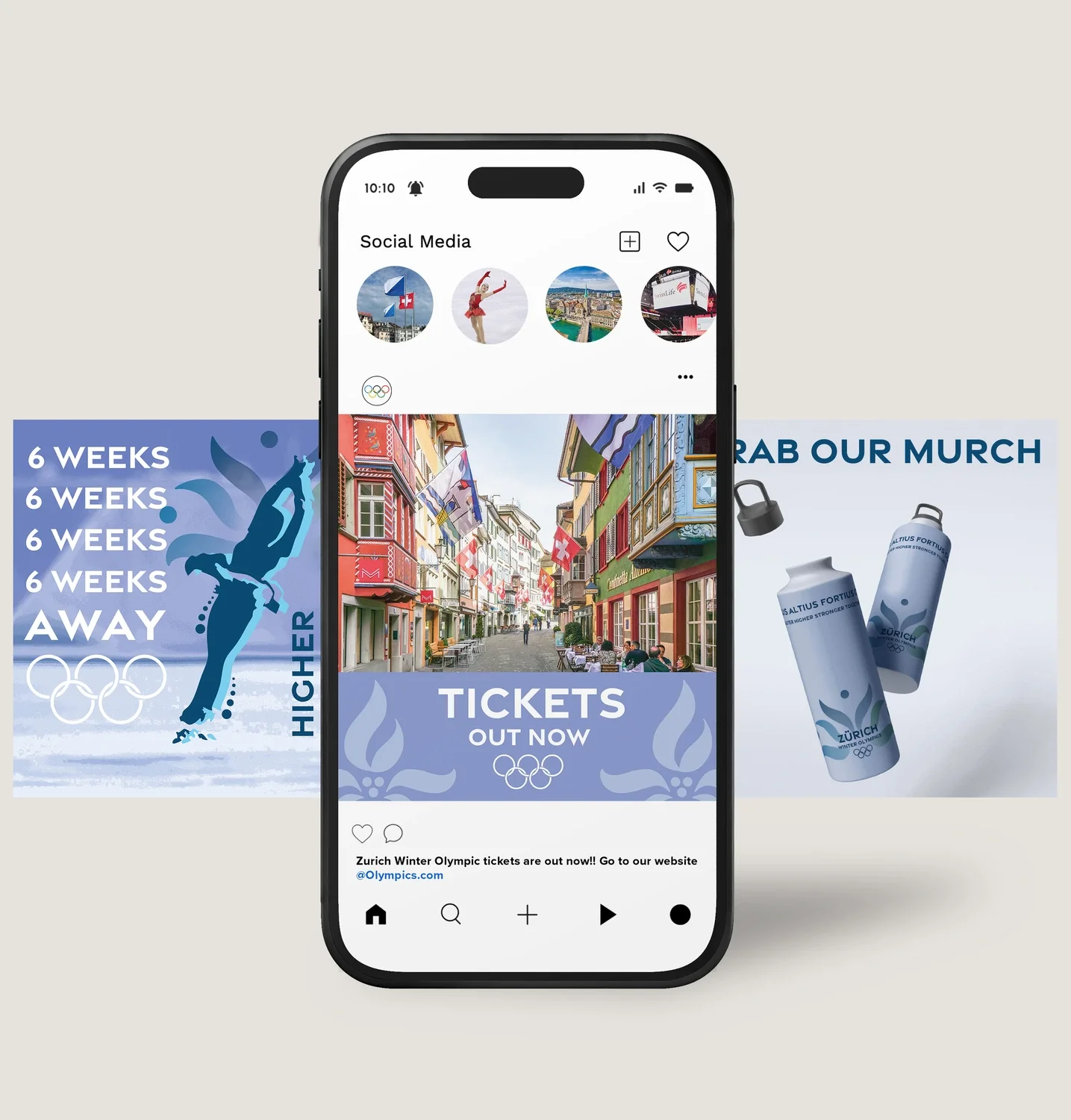
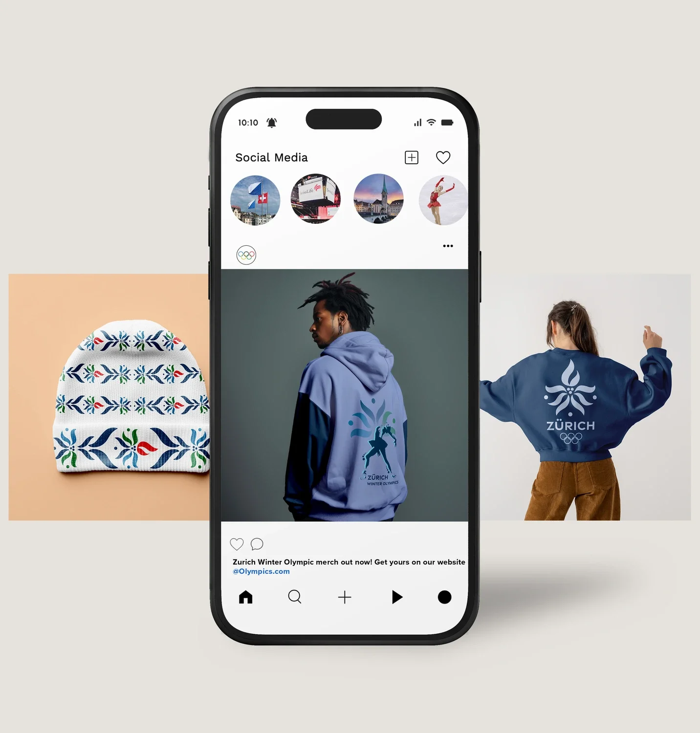
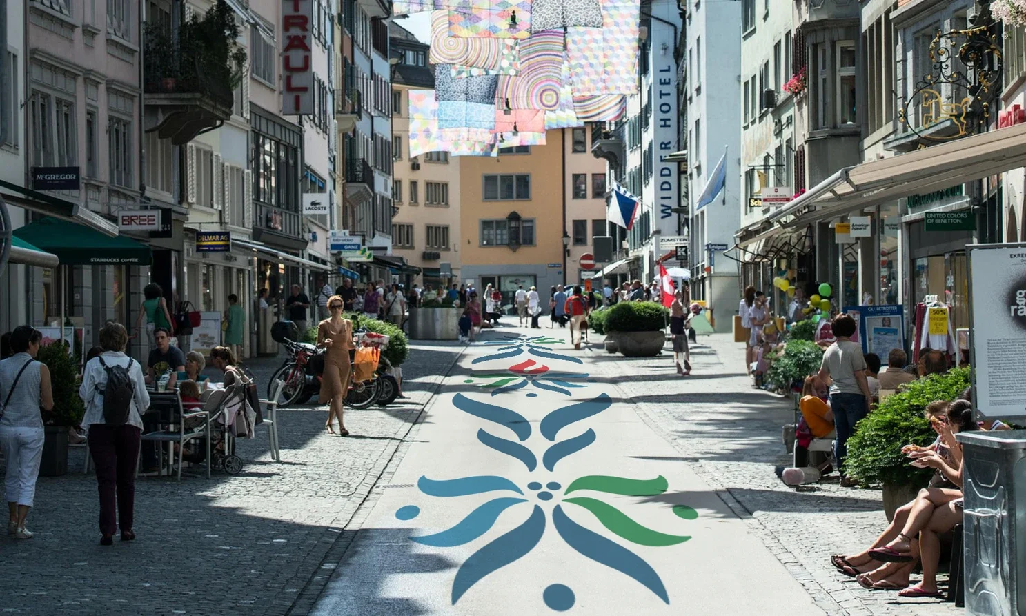
Environmental Graphics — Translating the identity into large-scale spatial experiences
Signage & Wayfinding — Designing clear, intuitive systems that guide and inspire attendees
Banner & Event Graphics — Expressing movement, winter energy, and Zurich's cultural character across the city

The Thinking Behind It
Every element in this system was designed with intention. The palette and forms lean into the crispness of winter — that particular kind of energy that feels both still and electric. The graphics across banners, signage, and environmental spaces were built to move with people, creating a sense of momentum whether you're standing still or in motion.
This wasn't just about making something beautiful for a two-week event. It was about giving Zurich a visual voice — one that could hold its own on the world stage while staying true to the place it calls home.